Storybook
Installing Storybook
Because the RedwoodSDK is based on React and Vite, we can work through the “React & Vite” documentation:
-
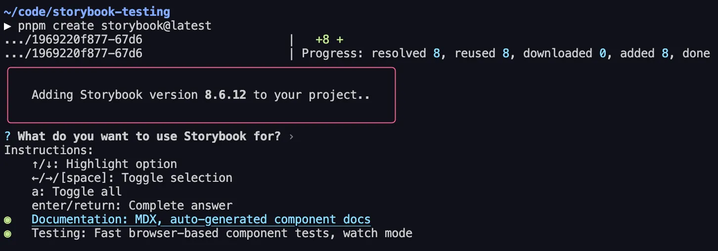
Install Storybook:
Terminal window npm create storybook@latestTerminal window pnpm create storybook@latestTerminal window yarn create storybook -
Select what we want to use Storybook for — I selected both Documentation and Testing, though this guide will only cover the documentation part:
-
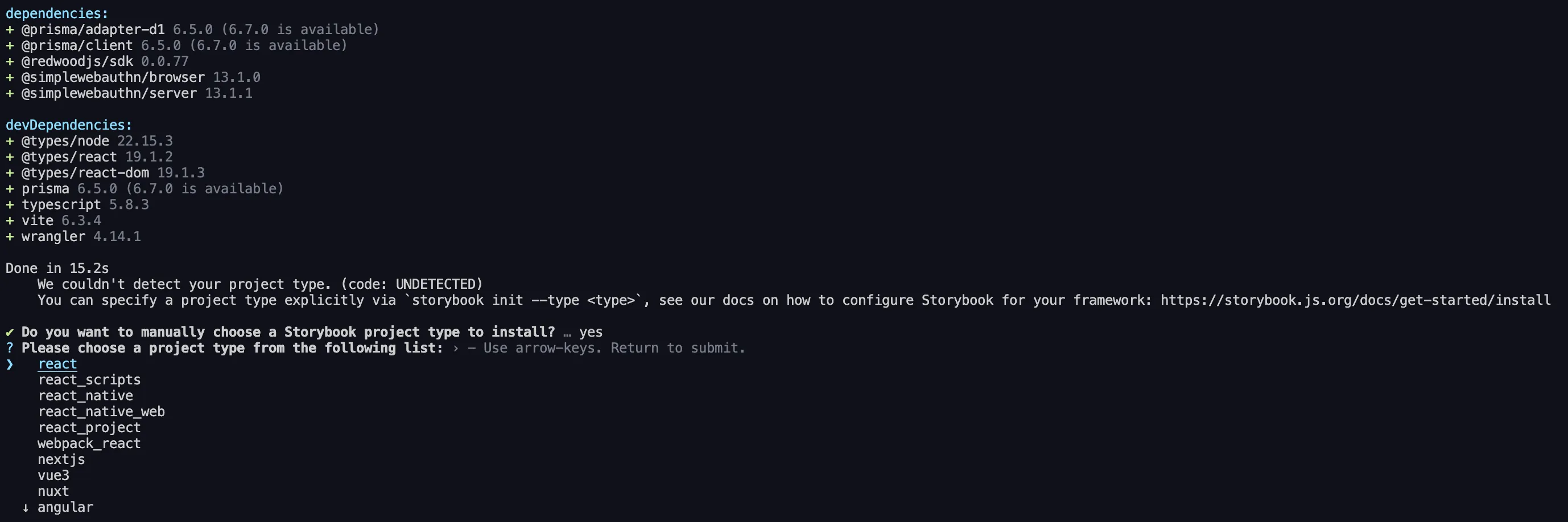
It’ll say it can’t detect the framework. Select React — it’ll automatically detect Vite:
-
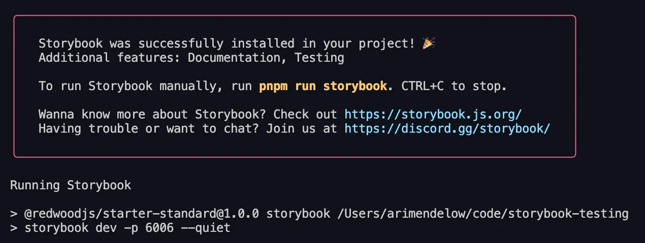
Storybook will finish installing, and then start our Storybook server:
-
It should automatically open our browser to Storybook, and if it doesn’t, we can go to
localhost:6006to see it: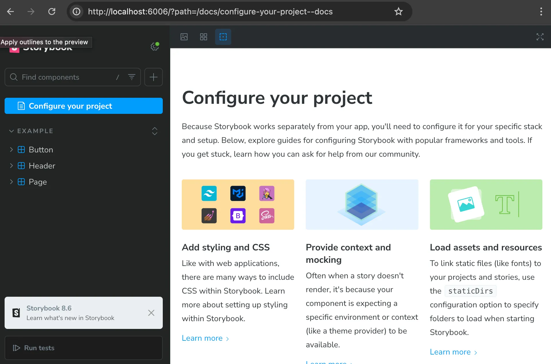
-
It also added
storybookandstorybook-buildscripts to ourpackage.jsonfile. We can always run thestorybookscript to start the Storybook server, andstorybook-buildscript to build our Storybook site for production:{"scripts": {"storybook": "storybook dev -p 6006","storybook-build": "storybook build"}}
Adding a Component to Storybook
In writing this guide, we’ve started by following the quick start instructions and set up the standard starter.
The standard starter comes with a very basic Home component:
import { RequestInfo } from "rwsdk/worker";
export function Home({ ctx }: RequestInfo) { return ( <div> <p> {ctx.user?.username ? `You are logged in as user ${ctx.user.username}` : "You are not logged in"} </p> </div> );}Given that this is very basic, we’d most likely want to build this out a bit more. Storybook is the perfect place to do that! Let’s see what that looks like.
-
Create a new file:
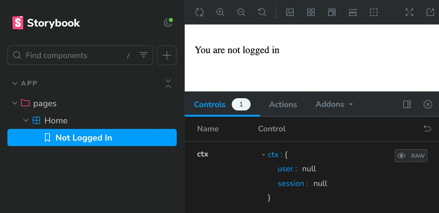
src/app/pages/Home.stories.tsxsrc/app/pages/Home.stories.tsx import type { Meta, StoryObj } from "@storybook/react";import { Home } from "./Home";const meta: Meta<typeof Home> = {component: Home,};export default meta;type Story = StoryObj<typeof Home>;export const NotLoggedIn: Story = {args: {ctx: {user: null,session: null,},},}; -
Save, and go back to our Storybook site. We should see a new “Home” section in the sidebar:
-
Great! What if we want to mock the logged in user? We can do that by adding a new story, this time passing in a user object to the
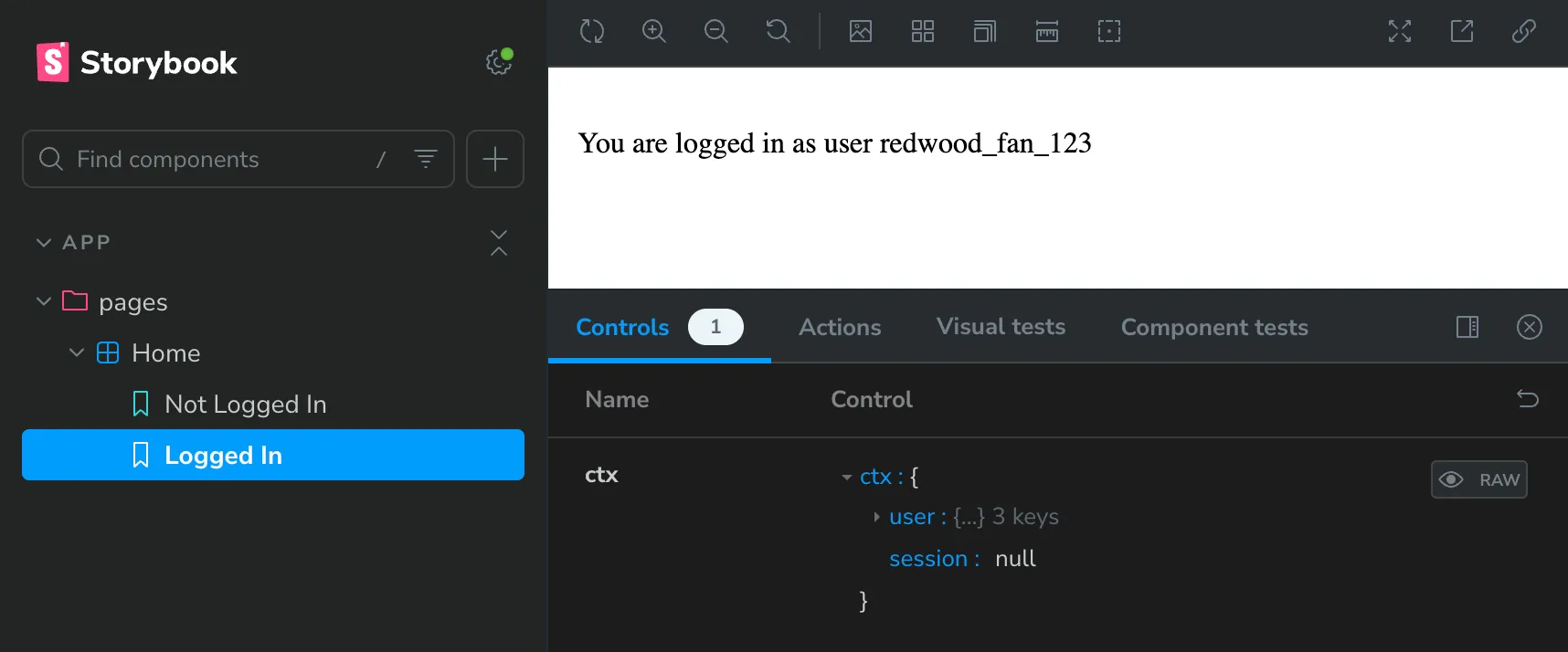
ctxprop:src/app/pages/Home.stories.tsx import type { Meta, StoryObj } from "@storybook/react";import { Home } from "./Home";const meta: Meta<typeof Home> = {component: Home,};export default meta;type Story = StoryObj<typeof Home>;export const NotLoggedIn: Story = {args: {ctx: {user: null,session: null,},},};export const LoggedIn: Story = {args: {ctx: {user: {id: "1",username: "redwood_fan_123",createdAt: new Date(),},session: null,},},}; -
Save it, and go back to our Storybook site. We should see a new “Logged In” story:
-
Great! But what if we want to be able to play around with the username that’s displayed? Sure, we can always click into the generated controls and change the username, but it’s a little ugly. What if we want to just have a dropdown with some options?
Thankfully, Storybook lets us override the generated controls via argTypes!
Username is nested in ourctxprop, and Storybook controls are meant to correspond with a given prop, so we need to create an array of all thectxpossibilities we want to test out. We can then give them each a pretty name, and Storybook will generate a dropdown for us — if we specify a list of options, Storybook will know to use a dropdown control.
Let’s do it:src/app/pages/Home.stories.tsx 20 collapsed linesimport type { Meta, StoryObj } from "@storybook/react";import { Home } from "./Home";const meta: Meta<typeof Home> = {component: Home,};export default meta;type Story = StoryObj<typeof Home>;export const NotLoggedIn: Story = {args: {ctx: {user: null,session: null,},},};export const LoggedIn: Story = {args: {ctx: {user: {id: "1",username: "redwood_fan_123",createdAt: new Date(),},session: null,},},argTypes: {ctx: {options: ["redwood_fan_123", "storybook_user", "example_user"],mapping: {redwood_fan_123: {user: { id: "1", username: "redwood_fan_123", createdAt: new Date() },session: null,},storybook_user: {user: { id: "2", username: "storybook_user", createdAt: new Date() },session: null,},example_user: {user: { id: "3", username: "example_user", createdAt: new Date() },session: null,},},},},}; -
Save it, and go back to our Storybook site. we should see a new dropdown for the
ctxprop — give it a try!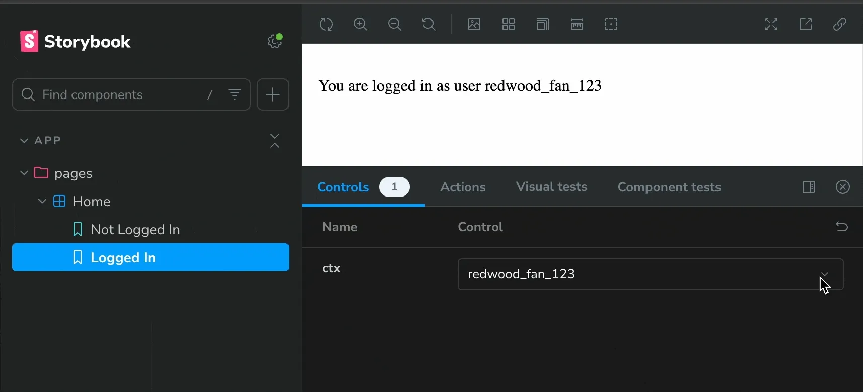
You did it! 🎉
We now have a fully functional Storybook set up with a component that we can play around with.
Mocking a dependency that’s not a prop
In the previous section, we mocked the ctx prop. But what if we want to mock a dependency that isn’t a prop? For example, let’s say we have a component that makes calls to our
database via Prisma.
-
Starting with the standard starter, the only thing in our database schema is a list of users. What’s the most obvious thing to do? List out all the users! Add this to our
Homecomponent:src/app/pages/Home.tsx import { RequestInfo } from "rwsdk/worker";import { db } from "@/db";export async function Home({ ctx }: RequestInfo) {const users = await db.user.findMany();return (<div><p>{ctx.user?.username? `You are logged in as user ${ctx.user.username}`: "You are not logged in"}</p><ul>{users.map((user) => (<li key={user.id}>{user.username}</li>))}</ul></div>);} -
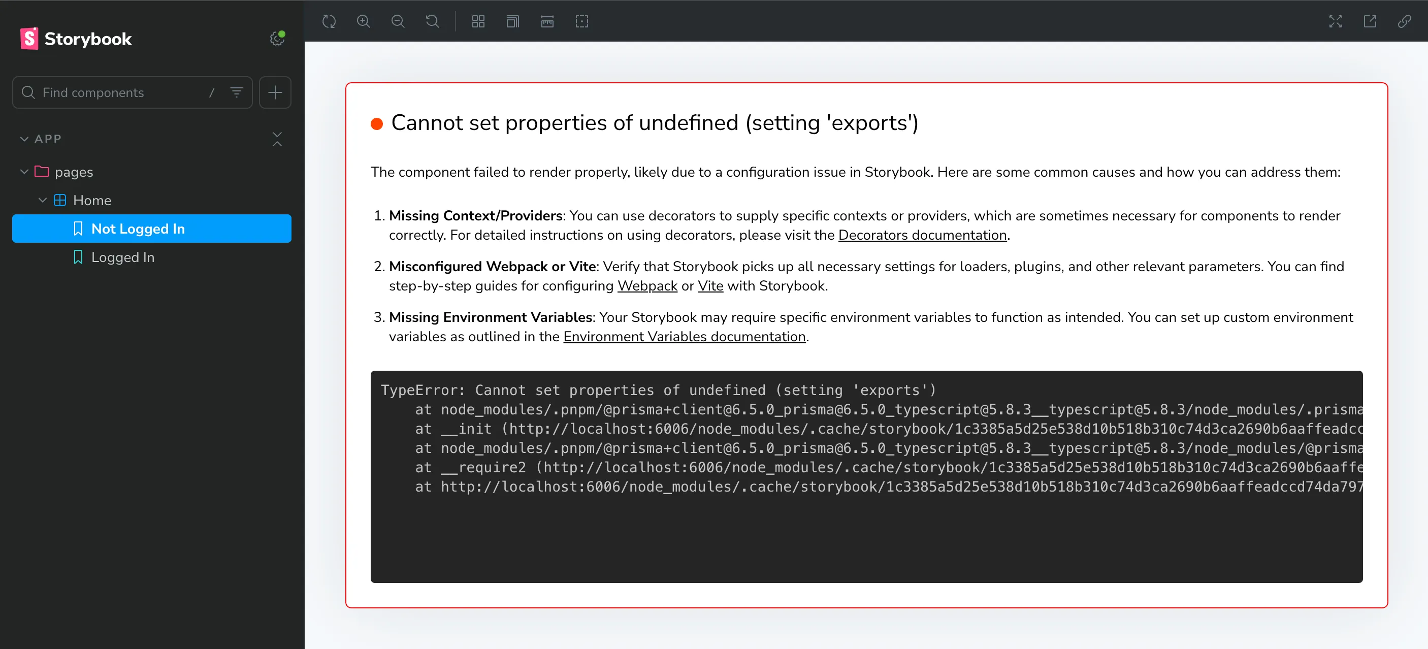
Now, if we go to our Storybook site, we’ll see that it throws an intimidating error. Take a closer look, and we’ll see that it’s coming from the Prisma client:
-
We need to mock our Prisma client. There are a few ways to do this, and Storybook and Prisma both have great documentation on this. For the sake of this guide, we’re going to do this the most straightforward way. First, we need to create a mocked version of our Prisma client. Create a new file right next to our existing
db.ts—src/db.mock.ts:src/db.mock.ts /*** First, mock the imported client.*/export let db: unknown;/*** Then, create a function to set the mock client.* We do this so that we can have test-specific mocks,* rather than having only one version of the mocked client.** @param [dbMock={}] An object to use as the mock client. Be sure to mock any Prisma functions used by the component we're testing.*/export function setupDb(dbMock: unknown = {}) {db = dbMock;} -
Now, we need to tell Storybook to use this mocked version of the Prisma client. We’ll do this using a Vite alias.
(We can instead use subpath imports, but it requires a bit more setup — we’d need to change any existing imports.)One of the Storybook config files is
.storybook/main.ts— this defines the behavior of our Storybook project. Open it up and add the following:.storybook/main.ts import type { StorybookConfig } from "@storybook/react-vite";import { mergeConfig } from "vite";import path from "path";const config: StorybookConfig = {features: {/*** `experimentalRSC` is required for rendering async server components in Storybook.* It works by wrapping all stories in a Suspense boundary:* https://github.com/storybookjs/storybook/blob/14e18d956fd714c594782fbf23c42765a8b599cd/code/renderers/react/src/entry-preview.tsx#L20-L24*/experimentalRSC: true,},stories: ["../src/**/*.mdx", "../src/**/*.stories.@(js|jsx|mjs|ts|tsx)"],addons: ["@storybook/addon-essentials","@storybook/addon-onboarding","@chromatic-com/storybook","@storybook/experimental-addon-test",],framework: {name: "@storybook/react-vite",options: {},},viteFinal: async (config) => {return mergeConfig(config, {resolve: {alias: {"@/db": path.resolve(__dirname, "../src/db.mock.ts"),},},});},};export default config; -
Every time we edit one of the Storybook configs, we’ll need to restart the Storybook server. However, if we do this before we finish mocking the Prisma client, our component will infinitely re-render. Let’s finish mocking the Prisma client first. Go back to our story, and add the following:
src/app/pages/Home.stories.tsx import type { Meta, StoryObj } from "@storybook/react";// Must include the `.mock` portion of filename to specify that that's what we want to importimport { setupDb } from "@/db.mock";import { Home } from "./Home";const meta: Meta<typeof Home> = {// https://storybook.js.org/docs/writing-tests/component-testing#beforeeachbeforeEach: async () => {setupDb({user: {findMany: () => [{ id: "1", username: "redwood_fan_123", createdAt: new Date() },{ id: "2", username: "storybook_user", createdAt: new Date() },{ id: "3", username: "example_user", createdAt: new Date() },],},});},component: Home,};44 collapsed linesexport default meta;type Story = StoryObj<typeof Home>;export const NotLoggedIn: Story = {args: {ctx: {user: null,session: null,},},};export const LoggedIn: Story = {args: {ctx: {user: {id: "1",username: "redwood_fan_123",createdAt: new Date(),},session: null,},},argTypes: {ctx: {options: ["redwood_fan_123", "storybook_user", "example_user"],mapping: {redwood_fan_123: {user: { id: "1", username: "redwood_fan_123", createdAt: new Date() },session: null,},storybook_user: {user: { id: "2", username: "storybook_user", createdAt: new Date() },session: null,},example_user: {user: { id: "3", username: "example_user", createdAt: new Date() },session: null,},},},},}; -
Now, restart the Storybook server (
CTRL + Cto stop it), and go back to the Storybook site. We should see our mocked list of users:Start Storybook Server npm run storybookStart Storybook Server pnpm run storybookStart Storybook Server yarn run storybook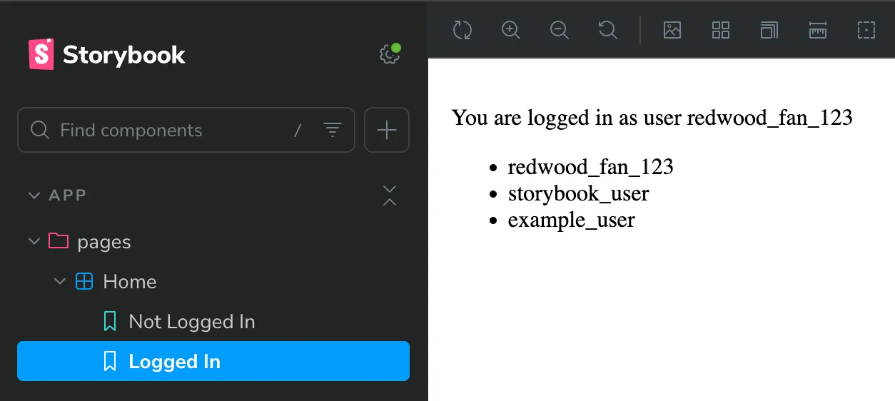
Continued Learning
You did it! 🚀 We now have a fully functioning Storybook project, and have started to explore the benefits of developing UI in isolation.
We’re also well on our way to having a robust, well-documented, and well-tested UI component library for our Redwood SDK project.
Some great resources for next steps are: